Happy Friday! What a week it’s been. We had very strong data from the labor market, whether it was JOLTS, ADP Employment, or non-farm payrolls. We also saw stronger than expected CB Consumer Confidence. But we also observed unemployment rising and the household survey show a slew of job losses.
In the markets we saw the divergence between QQQ and TLT grow to some of the widest levels I’ve seen. Is the correlation breaking down or are we going to snap back like a stretched rubber band? Time will tell. But tech does appear to be getting a bit stretched.

We can see that year-to-date it has been a rally of tech titans, but without too much breadth of participation from other parts of the market.

Which leads us to the next chart, showing that the percentage of S&P 500 stocks beating the index is at lows not seen since 2000. Often this extreme narrowness of upside participation when the index is rising portends to growing left tail risk.

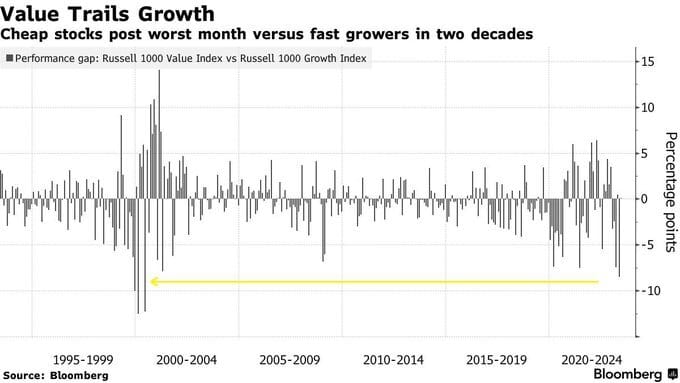
Value is also trailing growth by the most we’ve seen in two decades over the course of May within the Russell 1000.
Looking at price ratios, we can see similar between the NASDAQ 100 and Russell 2000, where the ratio between large cap tech and small caps is at its widest in two decades.

110 S&P 500 companies mentioned AI on conference calls during this earnings season.

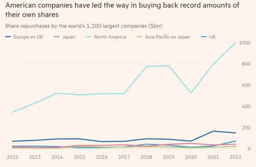
Buybacks are the American way, with Apple alone having bought nearly $600B of its own shares back over the last 10 years.
Speaking of the tech titan, Apple’s 2022 revenue is nearly equal to that of Meta, Sony, Lenovo, Oracle, Netflix, Nvidia, and Adobe combined during the same year.

Money managers are overweight bonds by the most since March of 2009, but unlike then we see tempting yields within fixed income tempting investors. Therefore the distribution of allocation does not appear to be a sign of seeking safety, but instead diversification.
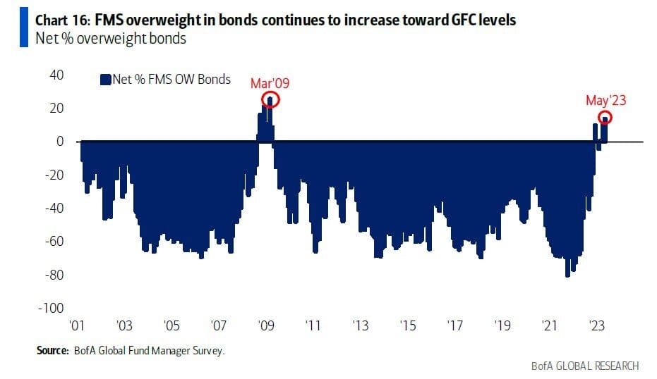
As seen another way, investors are overweight bonds, as well as staples, cash, utilities, and healthcare, and underweight US exposure, equities, REITs, insurance, and US dollar exposure.

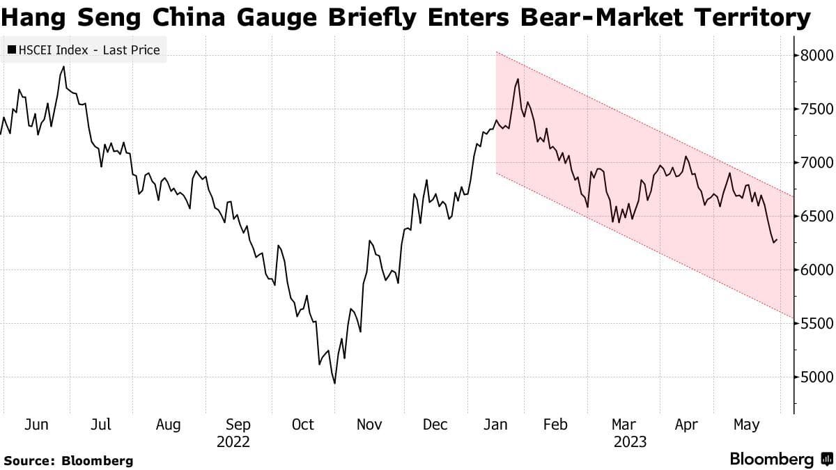
The HSCEI index is flirting with a bear market, having given back all year-to-date gains. The Chinese re-open seems to be much weaker than many had hoped to see.
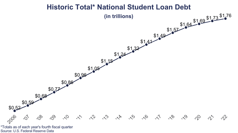
Student debt hit $1.76T last year, which is important to consider as we may see repayments kick in as the 20s to 30s are struggling with the highest credit card delinquencies since 2010.
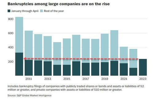
Bankruptcies among large companies are rising, starting the year with the highest level of filings since 2010.
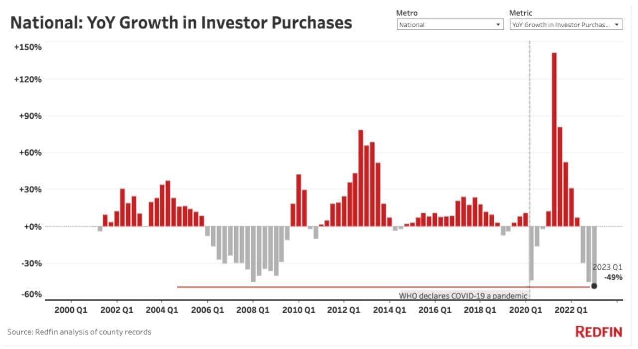
Investors are purchasing a lot less real estate, with the lowest year-over-year growth on record. Another sign that a high cost of capital and scarcity of lending is limiting appetite. We also have a limit of available supply.
Finally, after 13 months of falling leading economic indicators, the recession gauge continues to rise. Since 1960, we’ve never seen 6 or more months of falling leading economic indicators without a recession following. Will this time be different?
