We’re living in historic times, where almost every week there’s a new record broken or something else of an unprecedented nature unfolding. This edition of Charts of the Week is no exception to that trend.
For example, last Thursday brought us the largest S&P 500 call buying in history!

We’ve seen lots of short covering recently, according to Goldman Sachs. The largest amount since late 2022.

The largest seven stocks make up a whopping 28.2% of the S&P 500's weighting, this is the highest level since the peak of post-COVID crash bull run at 28.9% in late 2021.

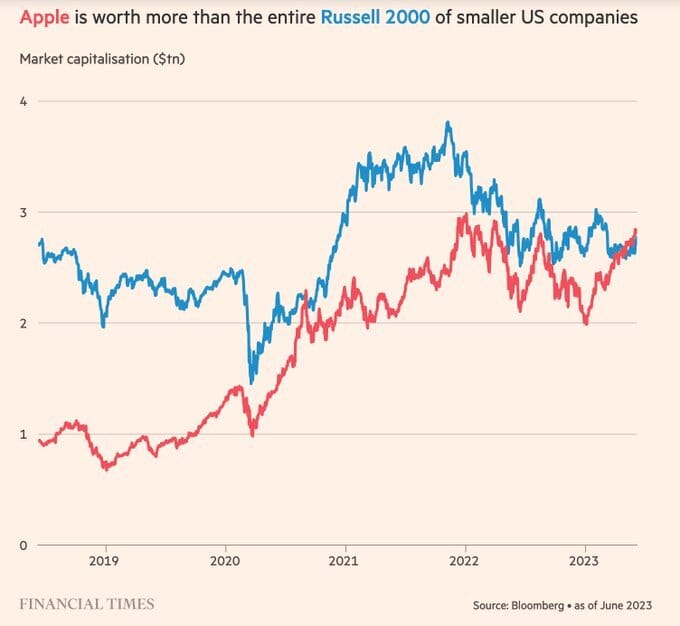
Apple is now worth more than the entire Russell 2000 combined, illustrating just how concentrated the flows into big tech have been. The Cupertino tech company has seen its earnings remain flat year-over-year (without accounting for share buybacks) and sales fall.

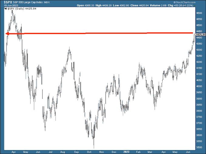
The S&P 500 is now higher than just before the Fed first started hiking on March 16th, 2022! Similarly, financial conditions have loosened markedly since they peaked last year, with a brief interruption during the regional banking crisis.

There’s a widening gap between the performance of the S&P 500 and the total assets of major central banks (Fed, ECB, and BoJ). This may suggest that risk assets are becoming a bit frothy.

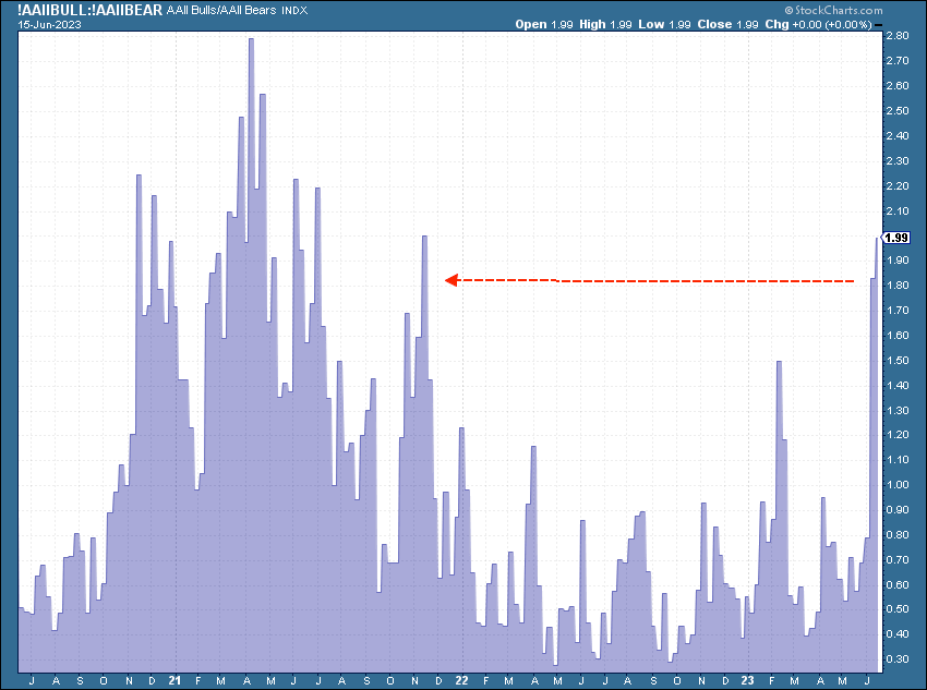
Speaking of froth, retail is the most bullish since November of 2021, per AAII. A clear indication that sentiment is reaching an extreme.

There’s no shortage of wild readings here. Retail recently bought the most stock exposure since the second half of 2021, according to BofA.

The growing divergence between QQQ (the NASDAQ 100 ETF) and TLT (the iShares 20+ year Treasury ETF) is the largest I’ve seen in the last two years. It continues to suggest that there is potentially some room for equities to catch down, particularly with risk premiums at the lowest levels in over two decades.

In yet another indication of the market potentially disconnected from reality, the Shiller PE ratio is presently at a whopping 30.19! The max is 44.19, from the Dot Com Bubble's height The mean is 17.03, suggesting that we're at quite elevated valuations, particularly given rates.

Meanwhile, Morgan Stanley expects the current earnings recession to bottom around -16% in the second half of 2023. Suggesting that the Shiller PE could rise further even if the market moves sideways as valuations could see more trouble ahead.

Curiously, one reason the Fed can't continue to hike too aggressively is that unrealized losses at FDIC-insured banks are around $500B during Q1 2023. Improvement yes, but banks are not out of the woods. Chair Powell even spoke about some of his concerns regarding the banking system at his speech last Wednesday, a theme that has been increasingly on the Fed’s radar for over 6 months.

The durability of core inflation within US CPI remains a concern for the Fed. If we annualize 0.4%, we're at 4.8%. Well above any reasonable target for where the Fed wants to see this more sticky inflation.

Speaking of inflation, credit card debts have surged to over $1 trillion for the first time in history as many lower income consumers are borrowing to stay afloat as their cost of living rises.
There are 165.3 million credit card accounts in the United States, with an average debt of $5,733 per borrower. That's a total of $917 billion! Credit card rates over the last three months have averaged 20.09%, which is a significant rise from pre-COVID levels of about 15%.

In closing, I hope that you enjoyed this Charts of the Week.
May we live in interesting times, right? 😉